
Gesture navigation has become the default on nearly every Android phone sold today, promising a cleaner, more immersive experience. Yet, despite this shift, the older three-button layout remains a mandatory option on all Android devices. This isn't due to laziness or a failure to innovate; rather, it's a recognition that buttons serve a critical role for millions of users who find gestures challenging or impractical. Understanding the real reasons behind this persistence reveals a commitment to accessibility and usability that goes beyond surface-level design trends.
The three-button layout is smarter than you think
Gesture navigation shuts out millions of people
A common assumption is that gesture controls are universally intuitive. Swiping from the edge of the screen feels natural to those with full hand mobility or those who grew up with touchscreens. However, these gestures demand surprising physical precision: the right speed, angle, and exact placement along a narrow strip of glass. For individuals with hand tremors, arthritis, Parkinson's disease, or other mobility limitations, consistently hitting these invisible trigger zones can be nearly impossible. This is not a minor inconvenience; it represents a significant barrier to using a smartphone effectively.
The older generation, accustomed to physical buttons with clear tactile feedback, also struggles with gesture navigation. A button that you can see and feel under your thumb provides a certainty that swipes lack. If a user was never taught the specific swipe motions or the secret combinations, they are left hunting for a moving target that offers no feedback until success or failure. This learning curve is steep for many, making the phone less accessible to a broad demographic.
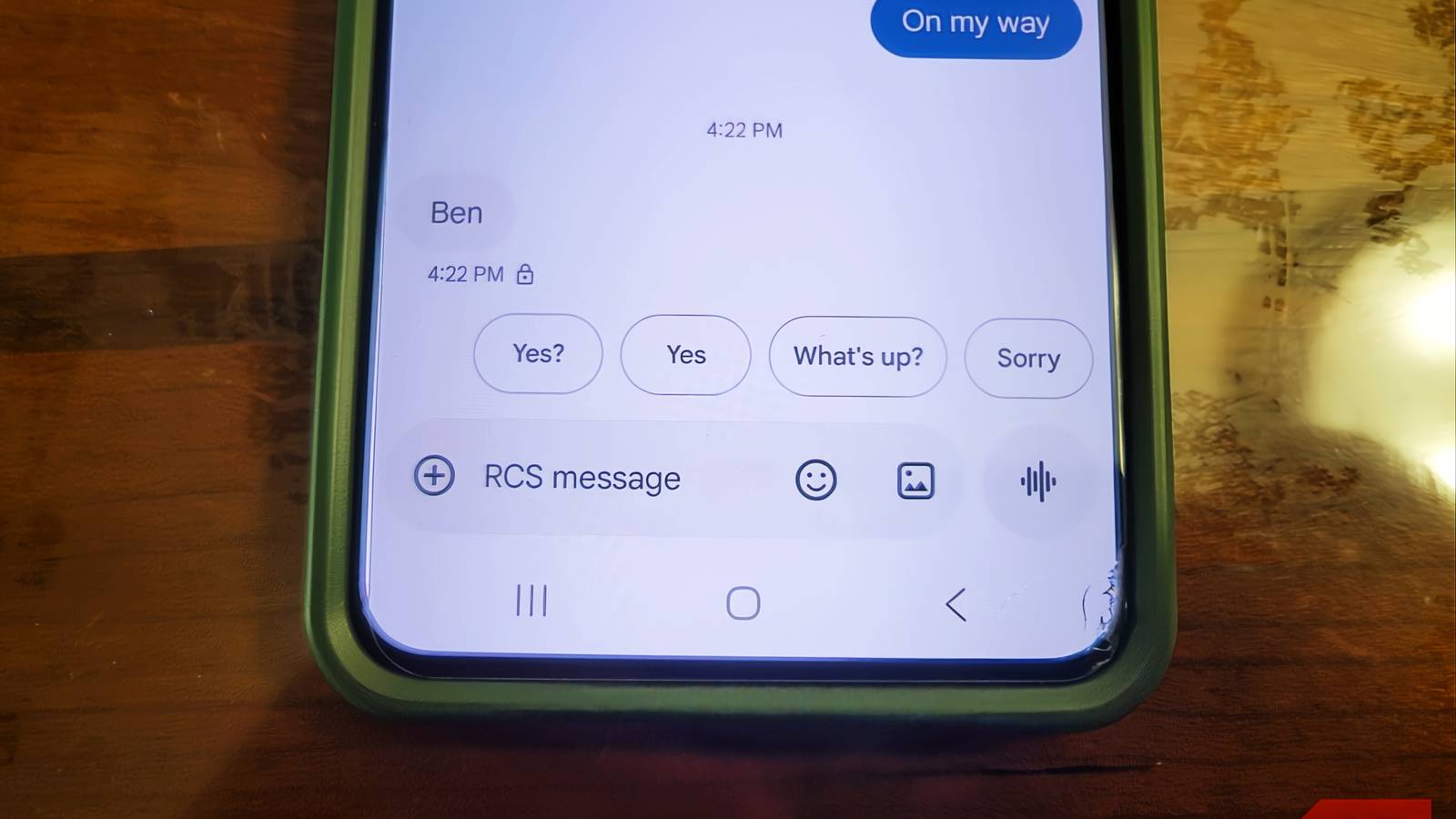
The three-button layout—Back, Home, and Recents—solves these issues by design. These buttons occupy fixed positions at the bottom of the screen, appearing in the same spot across every app. Your thumb knows where they are without looking, enabling fast, reliable navigation without cognitive load. This consistency is not a minor advantage; it is a fundamental principle of intuitive design. A static button pressed a thousand times is always more reliable than an invisible swipe zone that requires perfect execution.
Google understands this so well that the Android Compatibility Definition Document (CDD) mandates the inclusion of three-button navigation on every Android device. Phone makers cannot remove it; they can only set gestures as the default. This requirement underscores that accessibility is not optional. The CDD goes further, warning manufacturers that under-display fingerprint sensors cannot physically overlap with the button navigation area, preventing accidental triggers for those who rely on buttons.
Swipes are untrustworthy
Too much is happening on screen
Gesture navigation looks clean, but it frequently interferes with app functionality. The system relies on detecting swipes from the left or right edge of the screen, which conflicts with apps that use those same edges for their own controls. For example, trying to open a sidebar menu or pan across a map can unintentionally trigger the back gesture or switch apps. This leads to frustration as users are abruptly kicked out of pages or have their actions misinterpreted. Developers have limited ability to fix this because Android restricts how much of the edge can be reserved for app gestures to prevent disabling the back navigation entirely. As a result, apps that use full-height side panels will always conflict with gesture controls, creating a persistent usability issue.
Moreover, gesture navigation adds a small but noticeable delay. The system must track the start point, distance, angle, and speed of a swipe before deciding the action. This analysis takes milliseconds, but it introduces a perceptible lag compared to the immediate response of tapping a fixed button. In fast-paced use cases like gaming or quick navigation, this delay can be annoying. Three-button navigation bypasses this entirely: a tap is instantly recognized against a known coordinate, firing the action without analysis.
Thumb comfort and speed are more important
Cleaner doesn't always mean better
Removing the navigation bar frees up screen space, allowing apps to stretch edge-to-edge for a more immersive look. This aesthetic benefit is undeniable, but it comes at a cost. Phones are taller than ever, and constantly swiping from the far edges forces your thumb into wide, reaching movements across the glass. Over hours of use, this can lead to thumb strain and fatigue. Many users report discomfort after extended gesture navigation, with some developing physical marks from holding their phones in ways that accommodate swipes.
Three-button navigation gives your thumb a home base. The buttons sit in the same spot, close to where your thumb naturally rests when holding the phone. Tapping requires only a short, natural movement—about half an inch—rather than a full swipe across the screen. This reduces stretching, repositioning, and long-term strain. For people who use their phones extensively for work or daily tasks, this ergonomic advantage is significant.
Speed is another factor. Gesture navigation requires the phone to wait and analyze the touch input, while three-button navigation processes taps instantly. This difference might seem negligible, but in practice, it makes the interface feel snappier and more responsive. When you need to quickly go back or switch apps, the direct tap offers a seamless experience that swipes cannot match. We gave up one of the most convenient features of a phone—reliable, fast navigation—for more screen coverage, a trade-off that makes little sense when considering daily usability.
Switching back to three-button navigation won't appeal to everyone. If gesture navigation works well for you, there's no strong reason to change. The extra screen real estate is nice, and gestures feel fluid once learned. However, even for those who master swipes, the convenience of buttons remains compelling. Until gestures can match the reliability, speed, and ergonomic benefits of physical buttons, there's no reason to alienate users who cannot or prefer not to swipe. The three-button layout is not a relic; it is a thoughtfully designed solution that prioritizes human needs over visual minimalism.
Android's commitment to keeping this option ensures that smartphones remain accessible to a wider audience, including those with disabilities, older adults, and anyone who values efficiency over aesthetics. The real reason Android phones still ship with three buttons is not laziness—it's inclusivity and practical design. That's a reason worth celebrating.
Source: MakeUseOf News